
I have contacted Stylist magazine to ask them about the paper stocks that they use for their free magazine hand outs. I really like the stock used and this would be perfect for my design context book.
I was looking through the magazine and there are certain layouts within it that could work quite well with how I want to display my chapter that is called 'The world of type and image'
I could have little mini examples of different pieces of type and image in different contexts with a brief explanation below it.
The dimensions of the stylist magazine are w:23cm/h:29.5
Layouts within the magazine, I am going to use this an inspiration throughout my publication.
Introduction to magazine, editor writes a little opening piece to introduce the magazine and the contents, i could bring this into my design context book.
Advertising within the magazine. Full page imagery.
Creative Review
Foiling has been added to the logo of creative review here, adding foiling really enhances a design in my personal opinion and I would like to try doing this for my design context publication.
Below: Front cover of creative review.
Below: Barcode presented on the front cover of creative review, showing date, year and price.
Below: Creative printed on a different paper stock, printing on different paper stocks gives a really unique and different feel to the publication.
Below: Typography printed/screen printed onto front cover of creative review.
Eye magazine
Below: Spines of Eye magazine showing issue number and season of publication.
Below: Front covers of a collection of the Eye magazine, all being quite simple, showing a piece of design, the logo, issue number, season of publication and price.
Below: Uncoated section in Eye magazine, this is where I sourced my inspiration for my own publication from, using different stocks with the magazine to compliment the work on each page.
Below: Contents page within the Eye magazine, quite simple layout of type.
Below: The range of papers used within the Eye magazine.
Below: Design printed onto condat gloss paper this really compliments the design and gives it a really high quality, professional feel to it.
Below: Type layout within the magazine, these 3 colours red, black and white work really well together.
Quote from Marian Bantjes that I found within one of the Eye Magazines.


 Below: I love this piece of work in particular, the contrast between photography colour and black and white illustration combines perfectly.
 There is a strong focus on image and type used within there work.
 Logo design-very detailed and illustrative. I could see my logo looking something like this.
 Pattern design for magazine cover...found this piece in the Eye Magazine
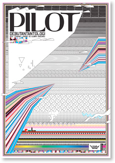


 Exising logo
 Below: Other promotional material for the brand.
  Below: Existing flavour and pot of ice cream. Packaging is very playful and crowded.
 Below: Photography I have taken myself of existing packaging for the ice cream pots. I get a fun, playful vibe from the overall look of it and i want to bring this across in my work that i produce for Ben & Jerrys.

 Below: Pots of ice cream that you can purchase at the cinema, they come in small, medium and large. Simple illustrations and logo are displayed on them, nothing too complicated.


