 Illustration based.
 Experimental type and image combined.
 Illustration based!
 Illustration based.Experimental type and image combined.Illustration based!
 I love this piece of advertising for Paul Smith floral, it is bright, vibrant and photographed beautifully in an appropriate context which really benefits the work and attracts attention.
 Using design for bottle packaging, simple but yet effective design and easily recognisable to Paul Smtih.
 Poster design focusing on shapes and colour.
 Experiemental typography, put into the context of a poster for an exhibition.
 Type face made to look like musical notes, black and white, simple but yet really effective. I would like to develop my own range of type faces for my website when I get one.
 Design for t-shirts, limited colour palette and use of experimental typography.


 Again developmemt of a type face for poster design.
 T-shirt design.

 Illustration for tattoo design. I would love to transform some of my illustrations into tattoo designs in the future.
 Simple illustration for t-shirt design.

 Design for clothing range, picked this example out for the way in which they have photographed the jumper made it a lot more interesting, shows how good photography can really make an impact.
 I love the different textures and stocks used in this leaflet above, changing the stock of your work really makes a difference to the final outcome and sets it apart from other work.
 Different ways of photographing work that you have done to make it look more interesting.
 Experimental typography, in this case used for self promotion. I have been told that you cant do enough self promotion so I really need to start focusing on this more.


 Above- creating type out of shapes and using a limited colour palette.
 Different techniques used such as embossing, creates individuality to work.
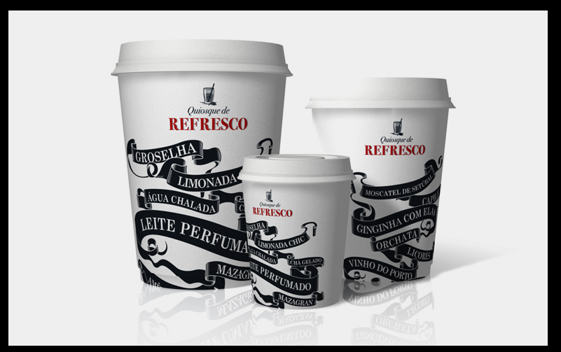 Taking type and placing it into appropriate contexts.

 Placing logo in context.
 Taking logo and placing it in context on website.

 I love this font above, it is so crisp and clear, I would like to maybe develop a font like this to use for my own work or maybe try and find one similar. It would look really good for title headings.
 Logo design
 Gold foiling on thick stock looks wicked.
 Above-type with and as image.
 Design used for a very commercial context. Design for album covers, I could really see my work fitting into this sort of context.

 Julia hoffmann
 Illustration for Mens health magazine. Work again for a commercial context, this deisgner was obviously commissioned to do an illustration for mens health and I would love to do that in the future.
 Illustration for the New York Times -above.
 Logo design-above. I'm not really interested in branding particually but I think that this logo was really cool.Simple but noticable.


