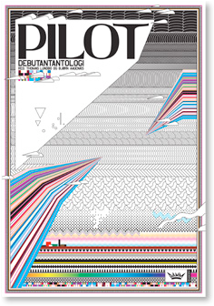
Below: This is a mock up of a sleeve that I could display my design context publication in.
I think I may just leave it on its on as I don't want to take away the quality of the publication.


Photography of my design context book showing the range of different paper stocks, layouts and colour use throughout my publication.
Below: Front Cover-printed onto bulky newsprint.
 Below: Pg 2-3- Page 3 is coloured card but wasn't printed on to. I wanted to have blank blocks of colour running throughout my publication to break it up and give it space and give people time to take in the information.
 Below: Pg 2, selfpromotion using my logo and details of where it was printed and the images I ahve used throughout my publication.
Below: Chapter page, printed onto bulky newsprint. The first 6 and last 6 pages were printed onto bulky newsprint to break up the book a little bit, I was a bit worried that the book would start to look like a scrap book but it has all fitted together really nicely. I got my inspiration for different paper stocks from eye magazine.
 Below: Introduction, printed onto bulky newsprint.
 Below: Example of one of the question and answer pages running throughout the first chapter of my publication. Layout was kept consistent.
Below: Section from the 'Fresh Creatives' chapter.
 Below: Layout example from chatper 1 'The Fresh Creatives'.
Below: Layout example within publication, this is communicating a quote from a designer.

Below: Example of chapter dividers, one page being coloured card and the other being bulky newsprint.
 Below: Another example of a question and answers page interviewing Alison Carmichael.
Below: Example of personal interview that I gathered myself from 'Talk the talk' chapter.


Below: Pages from 'The world of type and image' chapter. Printed on bulky newsprint and overlayed by type printed onto tracing paper to acknowledge images below it.


Below: Example of layout of quotes and chapter headings, printed onto bulky newsprint.
 Below: Final chapter 'My response' indicating my own personal work that I have produced in response to the work that I have been inspired by over the years.
Below: Finally the last page of my publication showing a piece of work from my favourite designer Alex Trochut, printed onto bulky newsprint.